Design and research create an accessible and user-friendly time picker
Setting a clock on a digital device is something that, at this point, many of us are familiar with. However, the way we set the clock is deeply shaped by mental models that differ between 12-hour and 24-hour clocks. We encountered this difference between mental models that led to an opportunity to rethink from the ground up how people interact with a component as familiar as the ubiquitous time picker.
Let’s back up and give you an explanation & context for our 24 hour analog clock redesign.
First, what is a time picker? A Time picker enables users to specify a time value. You may have used time pickers to set your phone alarm in the morning or maybe you’ve used it to schedule a meeting, book a flight, bus, or hotel, or even when searching for movie tickets to catch the new Marvel superhero movie.
Consider the first example – setting an alarm on your phone. How might that experience look?
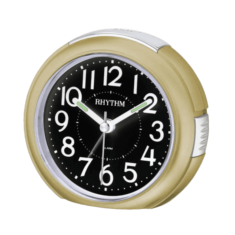
If you are a 12 hour user you can imagine that a 12 hour analog clock has the number 6 at the bottom and 12 at the top. You have both a minute hand and hour hand as well as an am/pm selection that affords you to take a single glance at the clock and know the time.
The Original 24 hour Analog Design
The first Material Design 24 hour clock was released in October 2020 and featured two rings – an inner and outer ring each representing a set of 12 hours to total to the full 24 hours in a day.
The second 24 hour analog clock aimed to address a handful of concerns related to accessibility and collision points of inner ring numbers. To address those concerns, Material moved towards a single-ring model. This design presented a single-ring with 12 on the bottom and 24 at the top. All “even” numbers up to 24 are displayed and there is a space in-between for odd numbers. Upon setting the hour, the clock then switches to a minute mode to set the minutes.
As the new design was released, feedback from the community was overwhelmingly positive except for the 24hr dial, in which we heard “Bring back the system’s two inner & outer circles.” Users who commonly use 24 hour selection were having difficulty using the new Time-picker’s 24hr single-ring dial. Users had become accustomed to the dual-ring design, this new convention didn’t follow the user’s anticipated mental model, and at first glance it wasn’t clear how to select odd numbers which were represented by spaces in-between the even numbers that were displayed.
Although the updated design addressed key accessibility concerns, there was still a disconnect between users’ mental models and the new 24 hour analog dial.
The Design Challenge
We met many challenges related to accessibility and making sure our users understand the analog clock dial.
Our designs explored both dual-ring and single-ring solutions. We explored the designs on small screens and found collision points of previous patterns resulted in numbers overlapping and the clock face becoming unreadable.
In addition, the 24 hour analog clock design presents unique design challenges, particularly with the user’s mental model and expectations for number positions on an analog clock face.
To tackle this challenge, Material prototyped over 50 unique designs not just exploring different visual treatments (single and dual ring), but also interaction such as long tap/hold, sliding, ring swaps, etc.
The team narrowed it down to 4 optimal designs that capture the spirit of Material 3, met our accessibility expectations, and addressed our user’s concerns. We went on to test the designs at scale in an international study evaluating the usability of each.
The Research Study
We conducted two mixed-method research studies to investigate the usability of 24 hour analog clock designs (a single ring and a dual ring design) compared to a digital input clock design. Data was gathered from over 50 people in 6 countries (India, Indonesia, Brazil, Germany, France, UK) to understand perceptions among users who use 24-hour clocks, 12-hour clocks or both. 10% of our participants considered themselves low vision users.
Both behavioral data (quantitative) and user opinions (qualitative) were collected to make the research recommendation. Our motivation was twofold: we wanted to know which design would 1) lead to fewer errors when setting times, and 2) be considered least confusing by participants. To evaluate this we asked participants to set the clocks to different times throughout the day (10am/1000, 5:30pm/1730, 2am/0200) on each version. Success rates were collected along with observational data as we watched participants set the times and recorded delays in setting the time. We also gathered rich qualitative data of the perceived negative & positive aspects of each design as well as which design was considered least confusing.
The Results
What did we find?
Even participants who currently use 24 hour clocks found all 24 hour analog designs unfamiliar and confusing. A 24 hour analog clock seems to be simply uncommon and breaks the mental model even in countries where people use the 24-hour digital clock.
Considering the analog clock designs, participants made the widest range of errors with the single ring design and only 4% of participants called it the ‘least confusing’ design. However, even the dual ring designs also resulted in errors as users were uncertain how to select time throughout the day.
An overwhelming majority of participants perceived a simple digital input as the least confusing and indeed made fewer errors on this design. We did notice that there would still be value in clarifying if it’s a 24 or 12 hour clock with a digital input design.
Credited to:https://material.io/


